Some Interactive Coronavirus Maps
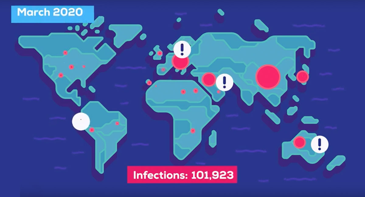 (Abbildung: © Kurzgesagt, via Our World in Data)
The media focuses on events. The news of print and television are all about moments and not able to show how our world changes, how trends change. However, trends are essential, especially with the spreading coronavirus pandemic. We all want to know when we can meet in person again, when work and leisure no longer need to be restricted.
The excellent stats-website Our World in Data from the Oxford Martin School focuses on slow but long-lasting developments. Their mission: to make data and research on the world’s largest problems understandable and accessible. And so it is no surprise that Our World in Data provides very helpful info graphics on the corona crisis. And they are well designed. And free. Some of them are interactive, are updated on a daily basis and can even be embedded, which I have done below.
1. Total confirmed Covid-19 cases
The following visualisation shows the number of total confirmed cases (in absolute numbers) and daily new confirmed cases for all countries that report their figures. The chart is interactive. The data is shown as the worldwide figures by default but can be explored by country: just click on ⊕ Add Country within the chart. The date here reflects to the date of reporting, not necessarily the confirmed case figures on that given day.
2. Total confirmed Covid-19 deaths
Here’s a similar visualisation like above, showing the number of total confirmed deaths absolute numbers). Also this chart is interactive and can be explored by country: just click on ⊕ Add Country within the chart.
3. Trajectories since the 100th confirmed case
The next chart answers questions like: Did the number of confirmed cases rise faster in China, Italy, South Korea, or the US? The starting point for each country is the day that particular country had reached 100 confirmed cases. The grey lines show trajectories for a doubling time of 2 days and a doubling time of 3 days. Countries that follow a steeper rise have seen a doubling time faster than that.
This visualisation is also interactive, so make sure to play with the region selector in the upper right corner.
4. Healthcare capacity: Medical doctors, beds
To respond to the pandemic, the capacity of the healthcare system if of great importance. The following two maps show the number of medical doctors and hospital beds relative to the size of each country’s population.
5. The current case fatality rate of Covid-19
The case fatality rate (CFR) can help us understand more about the severity of the disease, and how best to respond. There is no single figure of CFR for any particular disease, because CFR varies by location, and is changing over time.
The following chart shows the CFR for countries which have more than 100 confirmed cases, because CFR is a particularly poor metric to understand mortality risk with a small sample size. We see this if we look at the trajectory of cases and deaths in Iran: on February 24th it had 2 confirmed cases and 2 deaths, which would have a CFR of 100%. With time its CFR begins to fall as the number of confirmed cases increases, but it’s not until it reaches hundreds of cases that the CFR falls below 20%.
Also in this interactive graphic the data can be explored by country: just click on ⊕ Add Country.
<em>kursiv</em> <strong>fett</strong> <blockquote>Zitat</blockquote>
<a href="http://www…">Link</a> <img src="http://bildadresse.jpg">