Daily Covid-19 Stats Nº 21
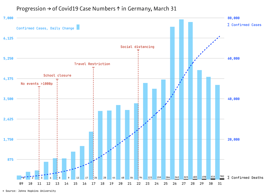
New visualisation of the corona spread in Germany: the daily new cases (bars), sum of the registered cases (dotted line), sum of the dead (black) … in between the political measures to curb the spread
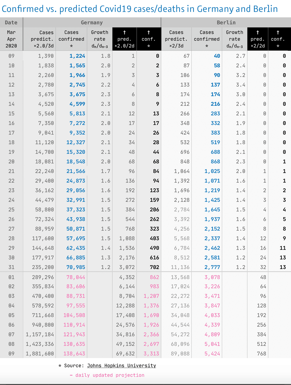
End of Day Summary (21). Apart from my scientific streak, it’s mainly my interest in design that has led me to build my daily coronavirus statistics. That’s why I have rethought and reorganized my style of visualization today. After more than three weeks with steeply rising exponential curves the daily deviations in the lower part of the coordinate systems are hardly noticeable. My focus are now the daily changes, not the forecasts, which can still be seen in the table, as well as the growth rates. The table is now at the end of the article.
The first figure (above) shows the increase of the registered Covid19 cases in Germany, from March 9–31. The focus is now on the daily new cases (bars), where the flattening of the infections is more apparent than in the dotted curve with the summed cases. The deaths (black bars) at the bottom of the chart seem a bit lost … I would like to change that in a revision soon. Particularly when looking back over an entire month, it is helpful to fade in the political measures, some of which at the end of the month seem much further away than they really are.
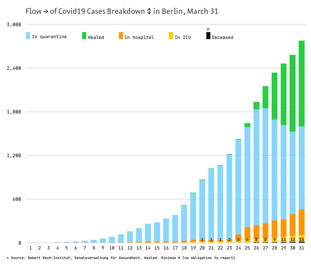
The second picture (above) is dedicated to the coronavirus conditions in my hometown Berlin. At the suggestion of some Twitter followers, I have now added up the total number of registered cases against 5 subgroups: the cured (green), the people in domestic quarantine (blue), the Covid19 patients (orange), the severe ICU cases (yellow) and the deaths (black with figures).
You can hardly see it in this presentation, but in the table below: The growth rate in Berlin today decreased from ×1.4 to ×1.2 (related to 3 days), which corresponds to a doubling of registered cases in 9.5 days. On Saturday, Angela Merkel set the goal “doubling in 10 days” … behold: We are slowly approaching this threshold.
Today’s Table – the complete picture:
Today, the number of registered cases in Germany has risen by 4100, and thus the development has slowed down again, what is also reflected in the growth rate, which falls by 0.1 for the fourth time: from ×1.5 (Sat), to ×1.4 (Sun), to ×1.3 (yesterday) to ×1.2; this corresponds to a doubling in 9.5 days, which can today really be considered a success of the distancing measures.
The increase in the number of deaths has also slowed today, to ×1.4 (from ×1.5 yesterday, this value had changed overnight), which means a doubling in 5 days and is still unfortunately high. But all virologists confirm that the number of deaths will lag behind the number of cases by at least a week.
3 Kommentare
Kommentarfunktion ist deaktiviert.
<em>kursiv</em> <strong>fett</strong> <blockquote>Zitat</blockquote>
<a href="http://www…">Link</a> <img src="http://bildadresse.jpg">
Erik Spiekermann
While I cannot right now think of a better way, showing 2 different data sets (the daily number and the sum total of confirmed cases) in the same y-axis (albeit far apart from each other) is always doubtful. But after looking at the graph for a minute, it becomes clear.
Thank you, Jürgen, this is by far the most useful chart I know for this topic.
Gerhard Großmann
At first I was a little confused, too, by the two different values in y-direction. The coloring makes it easier to understand, thank you! For me the question remains if there’s a relation between the two measurements, e.g. if 1,750 new cases is somehow tied to 20,000 registered cases or if the dotted line should be parallel to the bars.
The Berlin chart is really nice, thanks for these great diagrams!
Holger Fehsenfeld
@Erik
+1
@Gerhard
The only relation between the two scales is the attempt to spread both – the dotted line and the bars – over the whole area and to be able to draw only one set of horizontal lines for both scales.
The different colours, both being BLUE, seem to address a nice aesthetic ;-) Substituting one of them with the GREEN of the healed cases in the second chart might help to an easier understanding for those who are untrained interpreting charts with two y-axis.
Thanks to Jürgen for his excellent work and textual interpretations.