Die neue Grotesk-Familie „Werksatz“
Manches ist zeitlos, anderes wird sogar besser. Entweder durchs Altern oder den stetigen Gebrauch. Whisky. Die Musik von Stevie Wonder. Schriften. Zum Beispiel das Genre der Grotesk-Schriften. Generationen von Designern entdecken sie immer wieder aufs Neue. Und jede Genration von Schriftentwerfern interpretiert sie aus Neue. Auch Moritz Kleinsorge (Identity Letters), der gerade seine Familie Werksatz herausgebracht hat … „eine ewig aktuelle Grotesk, die altert wie guter Wein.“ Als Inspiration dienten ihm die skurrile Venus und die ewig junge Akzidenz Grotesk.
Auch im Bereich der Schriftgestaltung und -entwicklung steht die Entwicklung nicht still. Werkzeuge, Technik und Standards entwickeln sich unentwegt weiter. Die neue Werksatz spiegelt diese Tatsache wider, indem sie die besten Aspekte der Klassiker von damals aufgreift und mit der Technologie von heute neu belebt.
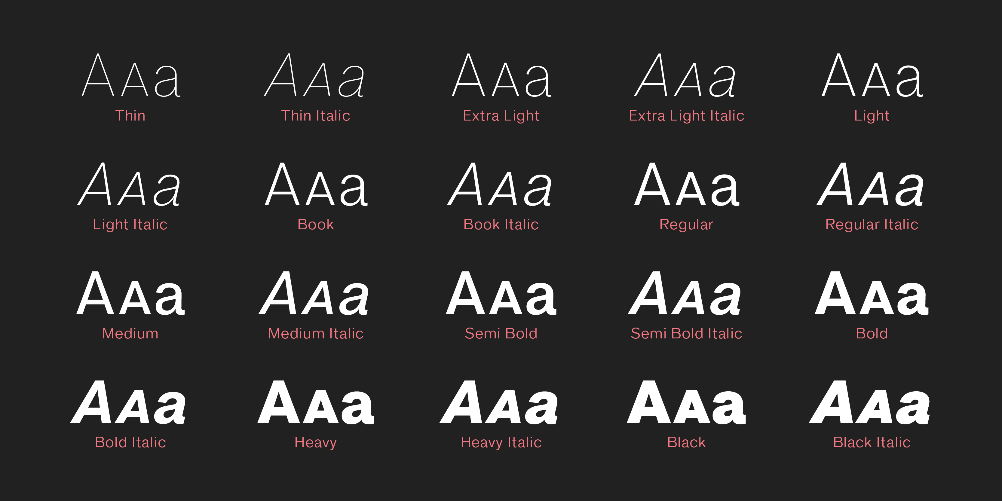
Mit zehn Strichstärken von Thin bis Black und 940 Zeichen pro Font ist die Familie bestens gerüstet für die typografischen Herausforderungen der Zukunft. Jeder Schnitt wird durch eine sorgfältig manuell ausgeglichene Kursive ergänzt, was 20 klassische Fonts ergibt. Werksatz unterstützt den kompletten Latin Plus-Zeichenumfang, wie er 2014 von Underware konzipiert wurde, so dass 219 Sprachen abgedeckt werden.
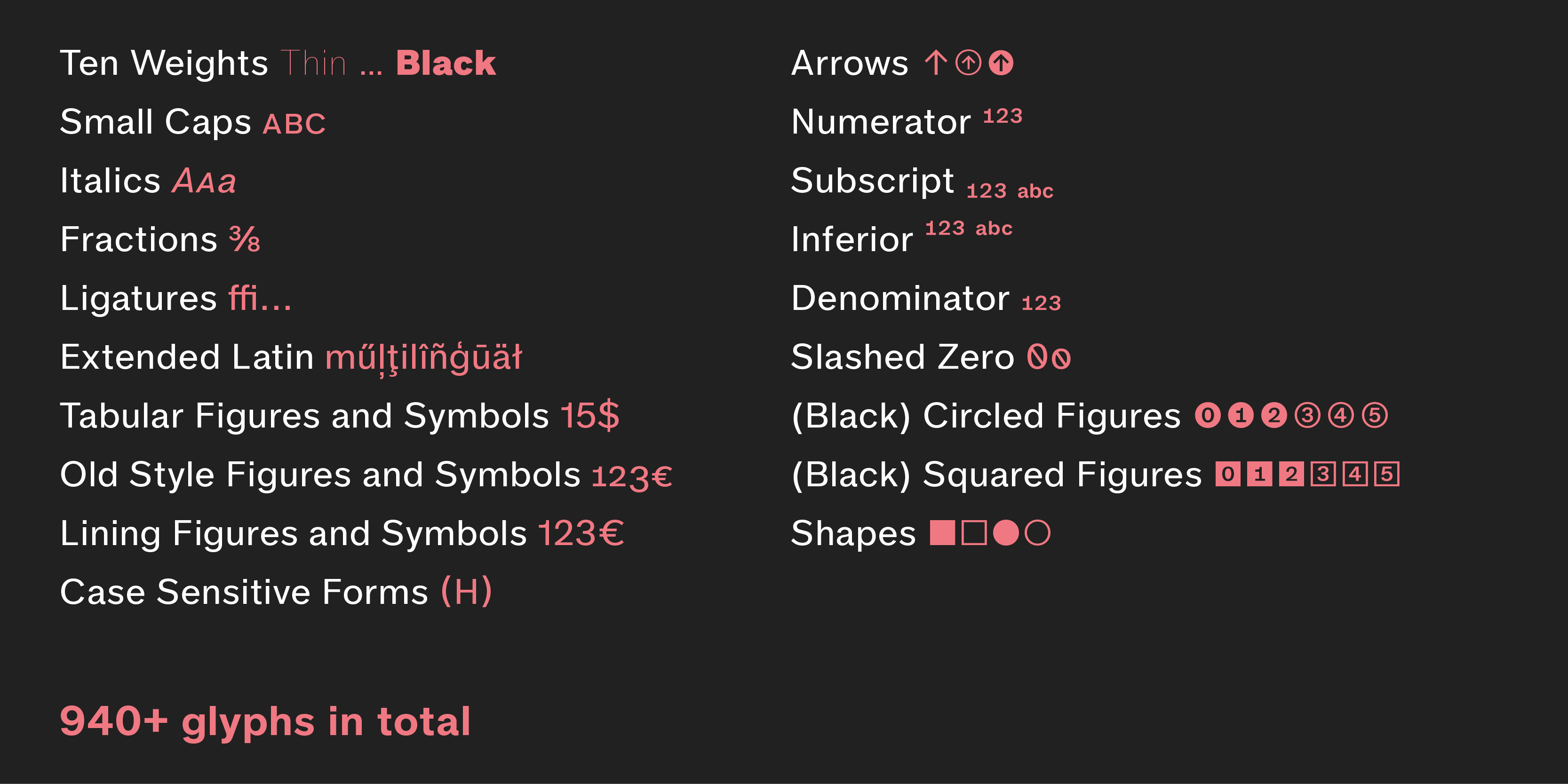
Werksatz ist reich bestückt mit OpenType-Features und bietet dabei sowohl grundlegende Funktionen wie Versalspationierung, Case-Sensitive Forms und Ligaturen als auch typografische Leckerbissen wie Kapitälchen, hoch- und tiefgestellte Ziffern und Buchstaben, diverse Ziffernsätze (proportional, tabellarisch, Mediävelziffern, kreisförmige und quadratische Ziffern, Ziffern für Kapitälchen), Null mit Schrägstrich und manches mehr.
Das Erscheinungsbild der Schrift ist neutral, aber weniger formalistisch und verschlossen als das vieler anderer Neogrotesk-Schriften. Werksatz eignet sich demzufolge uneingeschränkt für seriöse, ernsthafte Anwendungen, wie Corporate Design, Branding, Editorial Design oder Webdesign, für Branchen und Themen aus Politik, Management oder Recht, über Technologie und Handel bis hin zu Finanzen. Darüber hinaus hinterlässt der warme, menschliche Charakter der Schrift auch in Themenfeldern wie Kultur, Kunst, Mode, Unterhaltung, Sport, Freizeit und Luxus einen überzeugenden Einsdruck. Selbst für Leitsysteme, Apps, Packaging-Design und alle Arten von Sachbüchern ist Werksatz bestens geeignet.
Passend zu Werksatz entwickelt Moritz Kleinsorge aktuell die metrisch kompatible Serifenschrift Werkdruck, und lässt sich dabei über die Schulter gucken. Noch vor dem offiziellen Erscheinungstermin kann sie im Lab von Identity Letters zu einem deutlich reduzierten Preis lizenziert werden. Die frühe Investition lohnt sich: mit jeder Lab-Lizenz gibt es alle zukünftigen Verbesserungen und Erweiterungen der Schrift gratis per Update.
Werksatz gibt es im eigenen Shop von Identity Letters, aktuell zum Einführungspreis von 119 € (statt 400 €), jeweils inklusive Web- und Desktop-Nutzung (bis 10. Juni). Werkdruck in der Version 0.4 wird mit 9 Schnitten für faire 79 € angeboten.
Ken Garland, 1929–2021
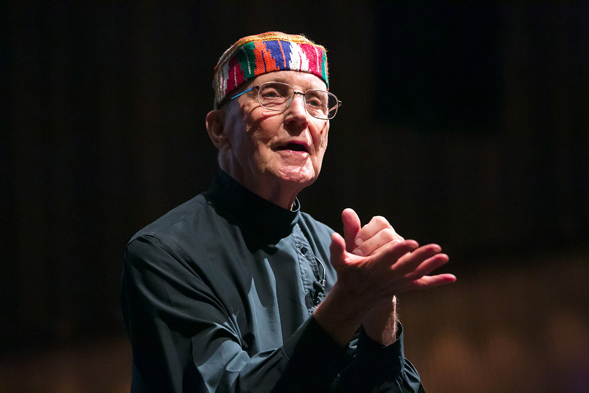
London-based designer, writer, lecturer, editor and publisher Adrian Shaughnessy (Unit Editions) took to Twitter yesterday to inform the international design community: “Sad news. Ken Garland has died. He died peacefully surrounded by family, friends and his wife Wanda. The world of graphic design is poorer without him.“
I first met Ken Garland at TYPO Berlin 2002 “Information”, where he was invited by Erik Spiekermann to talk about “70 Years of Urban Transit Diagrams: A Progress (?) Report“ (TYPO 2002 program sheet). The very title of his talk reflects two key traits of this pioneering design thinker: his humor and his relentless fight for a more progressive world through design.
Ken Garland was born in Southampton, and he grew up in Barnstaple, north Devon, next door to a farm, which he loved exploring as a child. He studied design at London’s Central School of Arts and Crafts, graduating in 1954. His classmates included Derek Birdsall, Alan Fletcher, Colin Forbes, Peter Wildbur and Philip Thompson. Ken’s first job from 1956 to 1962 was Art Editor of Design magazine, the trade journal of the Society of Industrial Arts. It was during this time that the spirit for Ken’s future work developed – human-centred, elegantly simple and rigorously conceived. In 1962 he left the magazine to form his own studio, Ken Garland & Associates, a small rotating group of designers who shaped British design for nearly 50 years. The studio’s clients included Galt Toys, Race Furniture, the Butterley Group, Dancer & Hearne, Barbour Index, the Labour Party and Paramount Pictures.
Ken’s entire career was marked by political activity. It began in 1962 with his work for the Campaign for Nuclear Disarmament (CND). He produced material for CND from until 1968. During this time he redrew the world famous peace symbol ☮ into the clean-lined graphic familiar around the world today.
In 1963 Ken Garland wrote and proclaimed the The First Things First manifesto “in favour of more useful and more lasting forms of communication“ and demanded “Reversal of priorities in favour of the more useful and more lasting forms of communication.” Ken claims for a ”society that will tire of gimmick merchants, status salesman and hidden persuaders”. The manifesto was backed by over 400 designers and artists and also received the backing of Tony Benn, radical left-wing MP and activist, who published it in its entirety in The Guardian. It was later updated and republished with a new group of signatories as the First Things First 2000 manifesto.
10 years after his appearance in Berlin, I had the great pleasure of meeting Ken again at TYPO London “Social”. Here you can find the video of his talk Word and Image … but beware, it’s on a veeeery slow server. In this talk, Ken is dealing with the original conjunction of spoken word and image: First come the spoken word; then the image; later, the written word; even later, the printed word.
One year later, Ken Garland opened TYPO Berlin 2013 “Touch”. Six years after the launch of the iPhone, which completely redefined visual communication, the term “touch” came to represent a whole new way of grasp information. But Ken kicked off the conference with an entirely different perspective on “touch”. He approached the subject with a visual exploration of what this word actually means to us. Is touch best visualised as a scene from Michelangelo’s Creation of Adam fresco on the Sistine chapel? Or, a picture of a a lion mother and cub. Or a picture of the touch of a loving parent holding the foot of a child? Or, a more poignant interpretation, the hand of a starving African hand, in the hand of a Westerner? Ken brought the audience through these, and a range of other images, in a captivating and genuinely moving talk that seemed all too short.
Our TYPO blog editor at the time, Paul Woods, now CEO & CCO of Edenspiekermann Los Angeles and acclaimed book author, captured the moment this way: “The main hall was in total silence for this legendary figure of design, as the audience hung onto every word. And, except for one slide showing an image of an infant touching an iPad, the presentation was free of any reference to technology or design, which made for a refreshing start to TYPO, given the theme.“
In September 2020, Ken Garland was awarded the London Design Festival’s Medal for Lifetime Achievement at a virtual ceremony. In doing so, the organizers recognized his influence and impact over 7 decades of tirelessly teaching, writing, speaking, photographing, and creating some of the most powerful and playful designs of the era. Oliver Wainwright of the Guardian reviewed Ken’s life on the occasion of the award ceremony … an article worth reading.
Länderlockerungen
Was passiert eigentlich nach der Bundesnotbremse, die seit dem 24 April in Kraft ist? Aktuell sinkt die 7-Tage-Inzidenz Tag für Tag. In vielen Landkreisen durchbricht sie gerade die 100-Grenze, der Auslöser für die Bundes-Regelung. Die Antwort ist einfach, aber total kompliziert: Jedes Bundesland entscheidet für sich, welche Lockerungen gelten.